An animatic is a series of still images edited together and displayed in sequence. In film and television work, the storyboarding stage may be followed by simplified mock-ups called "animatics" to give a better idea of how the scene will look and feel with motion and timing. A rough dialogue and/or rough sound track is added to the sequence of still images (usually taken from a storyboard) to test whether the sound and images are working effectively together. This allows the directors to work out any screenplay, camera positioning, shot list and timing issues that may exist with the current storyboard. The storyboard and soundtrack are amended if necessary, and a new animatic may be created and reviewed with the director until the storyboard is perfected.
We first decided on creating the camera shots and scenes on a storyboard. This way we knew what shots we needed to take, the length of the shots and the locations to take the shots. We were also able to see the order the shots would be in. We started by drawing the shots on the storyboard sheet that we thought would be good in a trailer. Then we wrote about the shot by the side of each drawing. Finally we numbered each shot in the order we thought would be best in the trailer. After completing our storyboard, we decided to film the sheets of paper the storyboard was on, this way instead of reading the storyboard on the blog, you can watch a video which also explains each of the shots in the storyboard. We then decided to create an animatic, as we had the shots and the order we wanted them to be in and thought it would be a good idea to see how it would look like, with the sound, dialogue and the mise-en-scene being added in with the shots. Doing the animatic was useful, as we were able to see how it looked like and could see some improvements and camera shots we needed to take. It was also especially useful for the sound, as we incorporated a few different pieces of music and knew how it could be improved.
When shooting our shots for the animatic, we decided to use our storyboard so that we could shoot all the shots for a particular location at one time. We had about seven different locations, using different props and changing the mise-en-scene in each one. This saved on time and we seemed to be more organized as we did one location a day. When doing the editing all we had to do was arrange the shots by using our storyboard. Altogether we had 28 shots in the animatic trailer; this included shots from the seven different locations, we also showed all the props that played a significant part in the trailer, like the key. Some of the props we included in the animatic were, a key, photos, a car, a phone and rope. We chose our actors based around their availability, as we had to take most of our shots in school and we knew who would be able to do it. By having actors we could rely on, we were able to keep to our schedule on when to shoot. There were some shots that we were unable to do, for example, a shot of the control room; this was because the technology was not available at the time. We did make some improvements when shooting our animatic, for example, we changed one of our locations which was in a closet for our beginning of our animatic, but there was too much light in the room so we decided to change the location. When comparing the storyboard to the animatic I could see a few differences that we had made, mostly improvements from our drawings to the actual photo, but the main difference were the camera shots and angles, as we could see the different shots and angles on the animatic, but it didn’t show on the storyboard.
When editing our animatic we first put all our shots onto the computer and put them in the correct order. We looked at our storyboard and thought it would be best to put the shots in the same order. At the beginning of the animatic trailer we decided to make the shots about four seconds long as it kept to the conventions of how normal trailers would be. Near the ending the shots speeded up, by the end the shots were one second long, creating a fast paste feel, which again when filming our trailer would keep the audience enticed and excited. Next we added our titles in-between our shots. The first title ‘A girl who has everything’ is shown 12 seconds in from the beginning of the trailer. The next title ‘locked in a room’ is shown a few seconds later. The title after that ‘with a limited amount of time’ is again shown a few seconds later. The final titles ‘to win’ ‘her’ ‘freedom’, were split up near the end and were shown quickly, each one after a camera shot, this again made the trailer fast paste. At the very end of the trailer we showed the title ‘illogic’ and used a special effect to make it appear mysteriously. After that the end credits are shown. We then added the dialogue and the sound. This was the hardest part of the editing but one of the most important parts of the trailer. At the beginning of the trailer we decided not to use any music, only the sound of the girl heavily breathing and the phone vibrating. We then hear the girl speaking and shouting, after that it cuts to a title. By doing this it kept to the conventions of thriller trailers, as it keeps the audience in suspense at the start, by which point the audience start to ask themselves questions, such as what’s happening? And why is this girl trapped? We felt this was the best thing to do. When the first title is shown the music starts slowly, getting faster and faster near the end. At the very end the music gets intense and finishes when the end title appears. There is also some more heavy breathing and screaming throughout the trailer.
We chose our length of shots by thinking how long they would be in the trailer and whether the audience would get board of the scene. We only had transitions when the titles would appear; this seemed to fit in with the music quite nicely. Near the end of the trailer we used slow motion which puts the audience in suspense. For the end title ‘illogic’, we used a special effect which made each letter of the word illogic appear after one another.
The titles we used are, ‘A girl who has everything...locked in a room...with a limited amount of time... to win...her...freedom...’ We decided on these titles as we felt it explained briefly the circumstance this girl is in. One thing we would do is add another title, as when we watched our animatic trailer, we found that we were missing a protagonist in it and we knew that we needed one in our real trailer. Another title we might add in our real trailer would be the main actors name as it would promote the film more, due to our actor being a recognised person. We chose the font style as thin and in white because it seemed serious and mysterious, and seemed to fit to the type of genre the film is.
It was difficult to find the correct music for the trailer as it didn’t suit our genre for our trailer, we managed to find some music which seemed to be suitable and decided to incorporate two different music tracks together and split bits of them up to flow with the pace of the shots. We decided the very beginning should have no music; this is because we wanted a quiet opener with the girl heavily breathing, this way the audience start to get interested and bond with the girl. We then decided to have a slow beat in the middle getting faster and sharper by the end of the trailer. The slow and fast beat of the music reflected the action and as there was a time element shown by the clock, we start to panic for her; at this point the music would have a faster beat.
Our target audience is 60% males and 40% females, aged 15-30. Even though we are missing a protagonist in our trailer I think the animatic would appeal to our target audience, as I think males are likely to find the film more interesting. It does show in the animatic that we are missing a male character, which is why we have decided on adding a few more shots of male characters, such as the boyfriend and the girl’s father. Our animatic has given us the opportunity to see this as we can develop it in our real trailer.
When making the actual trailer there are a few things I would change, as I have said above, the main change being to add more male characters. Another problem with the animatic was that we couldn’t see the different camera techniques that we could use in our moving image trailer, for example, panning shots, crane shots, tilt shots and tracking shots. In the moving image trailer there are camera shots I would add, like a protagonist playing the villain, also more shots of this girl’s parents (mainly father), boyfriend and friends; again this is mainly because we need to add more male characters to meet what the target audience is. The music we chose for our animatic can be improved, as I think there is music better suited for our trailer. I think we are missing some dialogue, such as, the girl speaking briefly to her parents. The lighting is key for each location, this is because near the beginning of the trailer we want to show scenes that are bright and clear, then near the end we want to show the scenes as darker and faster, this is to entice the audience and get them interested in the film. Also we need show more props, such as digital and analogue clocks, more interesting locations and sort out the technology we need before we start shooting the trailer.
Below I have chosen five key images from the animatic and analyzed them.
1) I have chosen this image as it shows the situation that the girl is in. This image is a medium close-up shot. She is locked in a room with light only coming from her phone. We used this image at the beginning of the trailer as it shows her at the present time. By the reaction on her face she shows she’s in distress and confused. The lighting, with the phone lighting up her face shows that she could be anywhere and the audience will be kept in suspense.
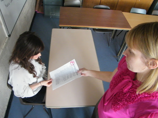
2) I chose this image as it shows the girl receiving an ‘A’ grade for her work from the teacher. We used this in the trailer as a past event. I think this is a key image as it shows that she is smart, even though she doesn’t bother to revise her work, so when it comes to the challenges that she will face, we know she could probably figure them out. This shot also suggests to the audience that her teacher could be the villain, as her teacher knows she shouldn’t be receiving these grades and might want to put her to the challenge. The image here shows a bird’s eye view shot.
3) This image is a close-up shot of a clock. I chose this image as it shows the time that the girl is faced with in each room. We used this image near the end and in our trailer will use a similar shot a few times, after one or two images, to make the pace faster. This draws the audience in as they start to panic for her. A light shows the face of the clock, but the rest of the background is dark.
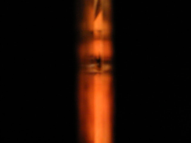
4) This image is an extreme close-up shot of the girl’s eye through a door. I chose this as it shows that someone could be watching her. The audience will be drawn in more and might think that she is struggling to get free and that there is hope for her. I think this is a key image as it slows down the pace of the trailer. This can frighten the audience as the trailer is constantly filled with fast shots, then this shot slows it down near the end, as it shows that the person who’s doing this to her could be on the other side of the door. This is a present day shot. The darkness at the sides with the light coming through the middle of the door creates a sense of freedom.
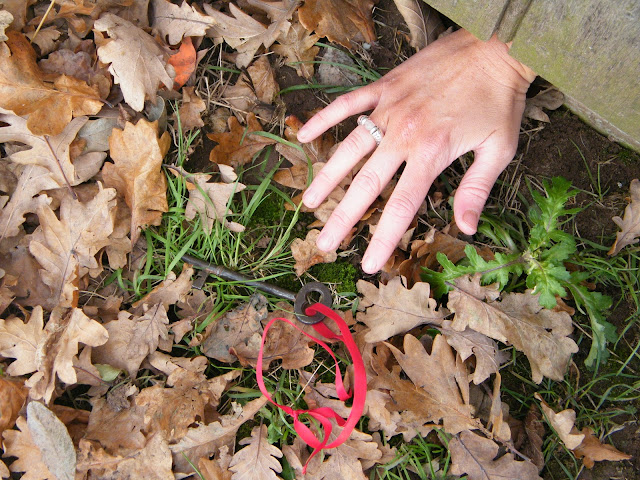
5) This is the final image I chose. It is a close-up shot of the girl’s hand reaching out under a door for the key, suggesting that the key is the only way to freedom. This is a significant image in the trailer as it shows that she could be close to freedom, but might just fail, keeping the audience in suspense so hopefully they then want to watch the film. We used this image at the very end of the trailer; it is a good shot to finish off the trailer as we want to know what happens to her next.
During this process I feel as though I contributed by doing some filming, planning and editing. I did some filming and felt that I learnt how to film particular shots and the different techniques to shoot a scene. I did some planning where I learnt how to set out when to shoot our shots, for how long and where to shoot the shots, I also feel that I learnt some more group skills and how to work in a group. I also did some editing where I learnt how to put all of our shots on the computer software, how to create titles, how to cut bits of our shots, how to add and remove music/sound/dialogue, how to add special effects and how to add transitions. As we are a small group of three we all contribute in the filming, planning and editing. We all help each other and try to have an equal part in the process, which is how I have learnt so many skills. When filming the real trailer, I feel as though I could contribute in the same ways as I did in the animatic. I have learnt the skills to film, plan and edit, and believe our finished product will be a lot more sophisticated as a trailer. As we have had a practice run to vaguely see how are trailer would look like, we know the things we need to improve upon and so, can make a much better film trailer.


No comments:
Post a Comment