Search This Blog

Wednesday, 11 May 2011

Compared To Real Media Outputs

*How does your trailer compare to real media outputs?
What trailer is your trailer most like and why?
Compared to real media outputs like ‘Buried’, ‘Shutter Island’, ‘Saw’ and ‘Devil’ we believe our film trailer conforms to the conventions of real media texts. Our trailer compares to Buried and Devil as they have the similarities in the narrative as both main characters/victims are in a life or death situations in a confined space and with a limited amount of time to escape. They also share technological and creative similarities as both are filmed using low lighting and a night vision technique. Saw is similar as there are life and death decision throughout the trailer with limited amounts of time to complete them. Our trailer is similar to Shutter Island as it shares the idea of the victim being the protagonist which we believe is highlighted at the end of our trailer with the medium shot of Nicole just standing facing the camera and the camera zooming into her blank expression

*Where would an audience view your trailer to see it?
An audience could view our film trailer in a multitude of different places, like at a cinema the certificate and genre of the film means that the trailer is usually shown in advertisements in similar kinds of films. The film trailer my also be shown on television on certain channels depending on the certificate and target audience, and online via computer, mobile phone, and tablet devices.
Once the film is released the trailer may also appear on similar certificate DVD’s or Blue rays.
Trying to promote across all platforms?
Radio – target specific stations, appealing to target audience,  radio1 kiss, radio Wales, Sunshine basically FM not AM
Television- show after specific times and on specific channels ‘sky horror/thriller
Internet- facebook and twitter – but how would you make sure the target age and above are only viewing the trailer! You tube
Magazines, Empire, Total Film.
 Posters, billboards, trains, personal websites, cinema.

*How successful do you think your film trailer is?
We believe our film trailer was successful and we are pleased with the professional finish due to the technological aspect of pace and sequence of shots. We used a range of transitions and effects which complimented the trailer. We also were proud of our choice of music as we used 3 sound tracks to create our finished product. The soundtrack compliments the shots very well and is in keeping with the pace of the trailer all the way through as it starts slow and rapidly increases. 8 out of 8 people agreed that the sound track complimented the shots within our trailer especially at the end where its creates emotional pleasures of heart racing due to fear for Nicole.
There are certainly aspects we could improve upon which are the special effects used on the production company at the beginning of the trailer, as we believe more animation is necessary like ‘Pixar’, however this was proven difficult as the technology was unreliable. The mise-en-scene of setting could have been improved upon at the beginning of the trailer in the past shots of Nicole being given the car. We each believe that improvements could be made on the choice of Title for the film (Illogic), this was also identified by two members of the focus group as they commented “grammatically correct and it would have made more sense if it was Illogical not Illogic”and another member of the group believe we should make it more simple and to the point. 
The film trailer was a success as all 8 people in our focus said they would want to go and see the film after viewing the trailer and know one in the group was able to identify or predict who the protagonist was.
Which part of the trailer were you most pleased with?
What part of the trailer would you improve?


*How did you identify the target audience for your trailer?
How have you used codes and conventions in your trailer?
Talk about length of trailer
Was too much revealed in your trailer?
Choosing a female lead and female protagonist meant that the two main characters were female and lead to us having a predominantly female target audience which broke conventions of real media texts, as psychological thrillers usually target a male audience.  To capture the interest of the male audience we have used male characters such as the boyfriend, the Dad and classmates. However the fact that the film is a Psychological thriller meant the trailer should attract a male audience anyway.
We decided our trailer should be around the 2 minute mark as after our research and planning stage we found that this was conventional.
We as a group were concerned about revealing too much and exposing the intellectual puzzle. However none of the focus group were able to identify the protagonist even though there were slight clues in the trailer. Also the audience did not now whether Nicole had escaped.

*How does your trailer appeal to the target audience?
Is an audience able to recognise the genre of the film that you are promoting?
What was the initial reaction of the audience feedback?
The trailer appeals to our specified target audience as we choose a female lead and female protagonist meant that the two main characters were female and lead to us having a predominantly female target audience which broke conventions of real media texts, as psychological thrillers usually target a male audience.  To capture the interest of the male audience we have used male characters such as the boyfriend, the Dad and classmates. However the fact that the film is a Psychological thriller meant the trailer should attract a male audience anyway.
Our trailer provides emotional and visceral pleasures as it makes the audience empathise with Nicole and gets their heart racing with fear due to scary scenes. People who enjoy the intellectual puzzle within films would also be attracted to our film. 
Along with the ancillary texts, the posters and magazine front covers we believe we have successfully enabled the audience to recognise our films genre through our creativity of using a night vision technique, and low lighting using the digital technology. Creating a sense of the victim and her being followed using creativity of the medium close-up of the reflection of the figure in the car window we then used Adobe premiere 4.0 to edit adding a slow motion effect so that the image became more clear and obvious to the viewer. Our audience feed back suggested that only 3/8 people recognised that the trailer was a psychological thriller, with the remaining 5 convinced it was a horror however whilst having a discussion 4 out of the 5 agreed that due to the lack of conventions needed to make the trailer a horror such as blood and gore it actually psychological thriller. One of the member of the focus group specifically pointed out that he thought it was not a horror because there was no obvious monster/villain. However we found a pattern where the three oldest individuals recognised the genre straight away.

*Is the audience able to see who the main characters were in the trailer?
Do you want the audience to know who the protagonist is?
We have conformed to conventions written by theorist Claude Levi –Strauss as it consists of certain clear binary oppositions like, good vs evil, rich vs poor etc. The main character, victim, Nicole is easily identifiable as the main character as she appear in the majority of shots and is clearly the victim. The female lead is also the main feature in both ancillary tasks therefore she is identifiable as the main Character.
As our chosen genre is a Psychological Thriller we do not wish for the protagonist to be identifiable as this conforms to the conventions of real media texts of this genre.
The other main character would be the protagonist (mother) however this is not identifiable for the audience. 

*How did you create the characters on screen?
In what ways did your characters represent the genre of the psychological thriller?
At what point in the film does the villain get revealed?
Did your audience think the setting was appropriate for the narrative?
Do you think your trailer could be better if you could use copyright music?
What are the key themes in your trailer?
Would you or your audience like these themes?
What aspects of your critical theory could you apply to your trailer?
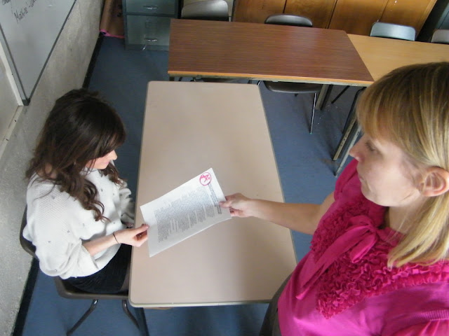
We have conformed to conventions written by theorist Claude Levi –Strauss as it consists of certain clear binary oppositions like, good vs evil, rich vs poor etc. We created the characters by analysing Propp’s theory of their being 8 character roles. We conformed to conventions of real psychological thrillers by having a female victim, however because we wanted to break conventions we decided to cast a female protagonist creating ‘the villian’. Our female lead was a young girl with a perfect life, we depicted this on screen with the use of different characters such as the good looking boyfriend and the generous father, we also used props such as the iphone and nice car. Our use of mise-en-scene such as the costume showed Nicole to be well-off as did the fathers attire which was a suit which gave the impression of a well off business man. The scenes of Nicole being handed a A grade paper shows her intelligence however this scene also highlights the envy of which surrounds Nicole, from both her teachers and her classmates, which leads to a numerous amount of possibilities of who the victim could be. However in the victim would not be revealed until the end of the film which conforms to conventions.
We believe the setting was appropriate for the narrative as we used conventions such as the confined space Nicole was trapped in, the creativity of the low lighting emphasised the narrative as it adds fear. We also used night vision technology to play on the emotional pleasure of our audience and to show that she is alone and has been singled out.
As our choice of music was a strong aspect of our trailer we do not believe the use of copyright music would have improved our trailer any further, as our soundtrack is unique and individual which it would not have been if we had used copy right music.

*How did you receive feedback?
Did the audience like the music for your trailer?
What did your audience think of your trailer?
we received feedback about our trailer by conducting an audience focus group, in which our selected audience of 8 people, predominantly female aged from 15 – 52 watched our trailer. After watching they then answered a questionnaire regarding our trailer. We then had a discussion on the answers they had chosen in the questionnaire and why they thought this. We then asked a serious of questions regarding to their opinions on whether our trailer would be an success if it was made into a film, and if they had constructed this project what they would do different.
100% of our focus group thought that our trailer targeted both males and females equally and that 50% of people noticed the reflection of the person in the car window.   The audience believed our soundtrack for our trailer was professionally done, with all 8 people saying that it complimented the shots we used. Also, no-one noticed the fact we had used 3 different soundtracks and blended them together. Some people specifically stated that the music was very professional and it built anticipation and one person thought that the screeching at the end and the monitores with the change in soundtrack was really effective.


*What are the strengths and weaknesses of your film trailer?
Do you think the story is clear?
We believe our film trailer was successful and our strengths were the professional finish due to the technological aspect of pace and sequence of shots. Our titles and transitions were shown in the correct order revealing a little about the narrative, and help the film trailer flow. We used a range of transitions and effects which complimented the trailer. We also were proud of our choice of music as we used 3 sound tracks to create our finished product. The soundtrack compliments the shots very well and is in keeping with the pace of the trailer all the way through as it starts slow and rapidly increases. 8 out of 8 people agreed that the sound track complimented the shots within our trailer especially at the end where its creates emotional pleasures of heart racing due to fear for Nicole. We have used a variety of camera angles, transitions and editing techniques which made our film trailer interesting and unique.
There are weaknesses which we could certainly improve upon which are the special effects used on the production company at the beginning of the trailer, as we believe more animation is necessary like ‘Pixar’, however this was proven difficult as the technology was unreliable. The mise-en-scene of setting could have been improved upon at the beginning of the trailer in the past shots of Nicole being given the car. We each believe that improvements could be made on the choice of Title for the film (Illogic), this was also identified by two members of the focus group as they commented “grammatically correct and it would have made more sense if it was Illogical not Illogic”and another member of the group believe we should make it more simple and to the point. 
Due to our use of titles we believe the narrative give a clear understanding of the situation Nicole is in. The only aspect we did not fully put across was the fact she had to complete puzzles to escape as we believe our film trailer did not portray this idea. The only comment one of the focus group made was that the beginning was slightly laboured however we believe from research and planning this is conventional.


*Explain how you used technologies in your project?
Why produce an animatic?
Why produce a story board?
We used a range of technologies throughout our project, the main technological hardware we used was a Video camera and the main technological software was Adobe premiere Elements 4.0.
We have learnt how light conditions effect the filming process and how they can create a mood and atmosphere. We decided to apply night vision technology for creativity to help emphasise our genre.
We used playback, to view our progress as we were filming, however we discovered this was not as valuable as looking at the filming on the Adobe premiere software. We used a selection and rejection process of what shots to use, therefore filming sometimes needed to be reshot after viewing on this technology.
            As a group we discovered that technology can be unreliable as we unfortunately lost some of our working progress on adobe elements, which was a minor set back, however fortunately we had backed up all of our filming time.
            The use of the internet during the research stage was used to research the market area we wished to target. It also helped me construct secondary research by viewing media forms on You tube and IMDB to view similar media texts and analyse them. For example my powerpoint analysis of ‘Devil’ and my analysis of the film poster ‘Shutter Island’ processed on Microsoft word. The Internet was also used to choose our soundtrack at freeplaymusic.com.
Our storyboard gave us a guide to how the sequence of shots would flow, we also discovered ideas which didn’t work and how to change them. It gave us a visual image of what our trailer could possibly look like. From our story board we conducted an animatic, this involved taking still images in the order of the sequence of our story board.      

*What was the most enjoyable process of the project?
If you had to do anything differently what would it be?
Would you prefer to write essays or blog?
The most enjoyable process of this project as a group was the production work, filming all the shots, and editing the shots together on Adobe Premiere elements.
We would improve upon the choice of our locations for shooting so that the trailer is more effective however it was very difficult as we didn’t have a very high budget. Time management is an area in which as a group we could definitely improve as our trailer would have been produced more efficiently.
What do you think of blog spot?
What do you think about your front cover?


 Success, professional in terms of pace and sequence of shots. We have used a variety of camera angles, transitions and editing  such as … see question 15 on research and textual analysis.

Critical perspectives

Advanced Portfolio
Research and planning

3.) We identified they key codes and conventions of our chosen film genre in our research and planning stage. Each of the group members carried out a full analysis of a film trailer with the genre of a psychological thriller, from this we each identified the codes and conventions and found that we all had answers in common.
4.) We developed the brief by conducting a storyboard, placing the shots and dialogue in chronological order, from this we developed the animatic which consisted of a variation of still images, constructed using the correct camera shots and angles, with dialogue and music.
5.) We decided on our genre after researching and analysing film trailers of different genres. From this we decided that the easiest genre to construct a trailer for would be a Horror or a Psychological Thriller. However as the majority of past students had created a Horror trailer we decided we would do something different. The main decider however, was the preliminary exercise we all undertook each writing a 500 word plot synopsis for a film. We then participated in a filmed discussion, deciding on which synopsis was most plausible. Mitchell won the decided vote which implicated our film genre.
6.) We targeted a specific audience from our redraft of our plot synopsis as we found the character gender and age along with the genre would implicate the target audience. From this we decided, gender 60% female and 40%male, age 15-40.
7.) We developed a plot synopsis so that we had a basic idea of our story line which enabled us to plan around it. It was the starting point of the film process.
8.) We made the decision about the content of our trailer by creating a storyboard which allowed us to conduct the flow of the trailer. We used the reconstructed version of our synopsis to form an idea of how the trailer should flow and from analysis real media texts we found the conventional way to structure a trailer was out of sequence.
9.)
10.) Connotations of the name of our film.
ILL – sick minded the mother.
Illogic – nothing about the trailer is logical, a mother trying to kill her child.
11.) Our storyboard gave us a guide to how the sequence of shots would flow, we also discovered ideas which didn’t work and how to change them. It gave us a visual image of what our trailer could possibly look like.
12.) From our story board we conducted an animatic, this involved taking still images in the order of the sequence of our story board.

Saturday, 30 April 2011

Tuesday, 12 April 2011

Editing The Trailer 12/04/2011

Today we edited our trailer some more. We managed to put the rest of the shots in order and our titles and transitions in order. We have edited:
  • The titles for the trailer. We have put them all in the correct order.
  • The transitions for each of the titles.
  • The control room shots.
  • The shot of the mum and dad handing Nicole the key to her car.
  • Nicole looking at the camera.
  • We also shortened a few other shots.
  • We also completed the music and sound for the trailer. 

Filming For Trailer 12/04/11

Today we filmed a few more shots for our trailer.

Location:
  • Inside of school
Props:
  • Compters
  • Keyboard
  • Mouse
Actors:
  • The main female actor (Nicole).
  • Nicole's mother.
  • Nicole's boyfriend.
Time:
  • All shots were filmed in the daytime.
Shots:
  • Nicole looks at the two screens in the monitor room. This is a present event in the film trailer. It will be shown in the middle of the trailer.
Camera techniques used in shots:
  • Over the shoulder shot
  • Close-up shot
  • Medium close-up shot
  • Long shot  
  • Point of view shot
  • Tilt  

Thursday, 7 April 2011

Filming For Trailer 07/04/11

Today we filmed a few more shots for our trailer.

Location:
  • Inside of school
  • Outside of school  
Props:
  • Phone
  • Key
Actors:
  • The main female actor (Nicole).
  • Nicole's mother and father.
Time:
  • All shots were filmed in the daytime.
Shots:
  • Nicole's mother is screeming into the camera. This is going to be used in the monitor room shot. This is a present event in the trailer. It will be shown near the end of the trailer.
  • Nicole's mum and dad giving her a new car. This is a past event in the trailer. It will be shown at the beginning of the trailer. 
Camera techniques used in shots:
  • Panning shot
  • Extreme close-up shot
  • Close-up shot
  • Medium close-up shot
  • Long shot  
  • Zoom
  • Tilt  

Tuesday, 29 March 2011

Editing The Trailer 29/03/2011

Today we edited our trailer some more. We managed to put the rest of the shots in order and our titles in order. We have edited:
  • The titles for the trailer. We have put them all in the correct order.
  • The scene where the pictures are falling over the girl. This is a present shot.
  • The scene where the girl is being dragged accross the floor. This is a present shot.
  • The scene where the girl is banging on the door. This is a present shot.
  • The scene where the girl is running outside. This is a present shot.
  • We also made some changes to our previous edited shots. We shortened different parts such as the car scene, and we have put some shots in a different order.

Thursday, 24 March 2011

Editing The Trailer 24/03/2011

Unfortunately what we have edited so far on the computer has been lost, so today we started re-editing for our trailer. We managed to retrieve all of our footage that we have done, and now have started to edit it into the correct place. Today we edited:
  • The very beginning of the trailer, where Nicole is trapped in a room and tries to answer her phone.
  • When Nicole recieves an 'A' for her work off the teacher.
  • When Nicole walks to the school with her boyfriend.
  • Nicole walking to her car and looking aroung because she thinks someone is following her.
  • When the pictures fall all around her.
  • Nicole trying to reach for the key.
  • Nicole running away from someone outside.

Monday, 14 March 2011

Thursday, 10 March 2011

Filming For Trailer 10/03/11

Today we filmed a few more shots for our trailer.

Location:
  • Inside of school
  • Outside of school
  • Inside of house
  • Outside of house
Props:
  • Phone
  • Key
Actors:
  • The main female actor (Nicole).
  • Nicole's boyfriend
Time:
  • All shots were filmed in the daytime.
Shots:
  • Nicole and her boyfriend walking into school. This is a past event. It will be shown near the start of the trailer.
  • Nicole's boyfriend screaming into the camera. This is going to be used in the monitor room shot. This is a present event in the trailer. It will be shown near the end of the trailer.
  • Digital clock counting down from 30-0 seconds. This is a present event in the trailer. It will be shown near the end.
  • Nicole in the middle of the quadrangle. She is running up the stairs and starts to look stuck. This is a present event in the trailer. It will be shown near the end.
  • Nicole walking towards the camera. She is stuck in the room and looks directly at the camera. This is a present event in the trailer. It will be shown at the very end.
  • Nicole being dragged backwards on the floor by someone. This is a present event in the trailer. It will be shown at the very end.
  • Photos of Nicole fall around her from the ceiling. This is a present event in the trailer. It will be shown near the end of the trailer.
  • Nicole banging on the door and falling to the ground. This is a present event in the trailer. It will be shown in the middle of the trailer.
Camera techniques used in shots:
  • Panning shot
  • Extreme close-up shot
  • Close-up shot
  • Medium close-up shot
  • Long shot
  • Birds eye view shot
  • Zoom
  • Tilt
  • Point of view shot

Monday, 7 March 2011

Editing The Trailer 07/03/2011

Today we did some more editing. We managed to complete a few key scenes in our trailer, which were;
  • The start of the trailer with Nicole locked in a room. This lasts around 15 seconds and shows the situation she is in. It is a present event in the trailer.
  • A past scene, where Nicole is seen recieving an A grade off her teacher. Where you can also see the jealousy of her friends and suprised look on the teachers face. This lasts about 5-6 seconds.
  • Another past shot, where Nicole is walking towards her car and sees a reflection of a person in her windscreen. This lasts about 5-6 seconds.
We also had a go at creating our titles, including our production company. At the moment we have decided to use 'Warlock Productions', as our company name. It will be shown at the very start of the trailer, which keeps in conventions with most film trailers. We have ued effects and transitions on the company name to make it more interesting. Our reason for using the name 'Warlock Productions' was mainly due to the fact, that it sounds like a company which usually creates adventure/action films. So by using the company for a thriller film, would make it more recognisable to the audience (if it were real), and gives us the chance to change the font and 'look' of the company name, to our genre type, which is what many companies would do, because then before you watch the trailer, the company name gives away what type of genre the film may be. All this should show that we have created a company name, that seems as though it has been running for a long time.

Tuesday, 1 March 2011

Editing The Trailer 01/03/2011

Today we imported all of our scenes for our trailer, off the camera and on to the computer.

Friday, 18 February 2011

Filming For Trailer 18/02/11

Today we filmed more shots for our trailer.

Location:
  • Outside by school;
  • Inside school classroom;
  • Inside and outside of Coryn's house.
Props:
  • Key;
  • Rope;
  • Phone;
  • Glow sticks;
  • Torch;
  • Car;
  • Bags
  • Car key.
Actors:
  • Nicole (the main female character).
Time:
  • All shots were done in the daytime.
Shots:
  • Nicole walks to her car, opens the door and sees someone in the reflection. This is a past event. A few different camera techniques were used here.
  • Nicole is locked in a room, she starts to wake up when the phone rings, then answers the phone. This is a present event. We also used make-up on Nicole's face, to show that she had been hit over the head. We also used nightvision mode.
  • Nicole's hand comes from underneath the door to try and reach the key which is on the other side. This is a present event.
  • A shot of the first game. Photos of Nicole falling over her head, each with a red cross through the face. This is a present event. We also used nightvision mode.
Camera techniques used in shots:
  • Extreme close-up shot
  • Close-up shot
  • Medium shot
  • Long shot
  • High angle shot
  • Birds eye view shot
  • Panning shot
  • Tilt shot
  • Over the shoulder shot
  • Point of view shot
  • Zoom

Wednesday, 16 February 2011

Filming For Trailer 16/02/11

Today we filmed more shots for our trailer.

Location:
  • School classroom.
Props:
  • Phones;
  • School bags;
  • Papers with grade written on them.
Actors:
  • The main female character (Nicole);
  • Her boyfriend;
  • Four of her other friends (male and female);
  • Her female teacher.
Time:
  • All shots were shot in the daytime.
Shots:
  • The girl walks into the classroom, followed by her friends. Her boyfriend walks in a few seconds later. This will be shown as a flashback in the trailer.
  • A shot of the classroom with all the students in, sitting down. Teacher hands out marked papers, when handing Nicole's back to her she has a fed-up look on her face. This will be shown as a flashback in the trailer.
  • A shot of Nicole's paper that the teacher just handed back to her. This will be shown as a flashback in the trailer.
Camera techniques used in shots:
  • Long shot
  • Medium shot
  • Close-up shot
  • Two shot
  • Panning shot
  • Over the shoulder shot
  • Zoom in and out
  • Birds eye shot

Tuesday, 15 February 2011

Filming For Trailer 15/02/11

Today we started filming our shots for our trailer.

Location:
  • School hallway;
  • School classroom;
  • Outside by school.
Props:
  • Phone;
  • Digital clock and;
  • Analogue clock.
Actors:
  • Main female actor;
  • Her boyfriend.
Time:
  • All the shots are set in the daytime.
Shots:
  • Main female actor walks down school corridor holding her boyfriends hand. This is a flashback in the trailer. Will be shown near the beginning of the trailer.
  • Main female actor walks outside by school holding her boyfriends hand. This is a flashback in the trailer. Will be shown near the beginning of the trailer.
  • Shot of a digital clock counting down from 30 seconds to 0 seconds. This will be shown near the end of the trailer.
  • Shot of an analouge clock; the time set at 12 o'clock. This will be shown near the end of the trailer.
Camera techniques used in shots:
  • Panning shot
  • Long shot
  • Close-up shot
  • Extreme close-up shot
  • Medium close-up shot 

illogic Storyboard


This is our storyboard for our trailer. Instead of putting each sheet of paper with are storyboard on, we decided to film all the papers together and explain what they mean.

illogic Animatic Trailer

Sunday, 6 February 2011

Critical Analysis Of Film Trailer Animatic

An animatic is a series of still images edited together and displayed in sequence. In film and television work, the storyboarding stage may be followed by simplified mock-ups called "animatics" to give a better idea of how the scene will look and feel with motion and timing. A rough dialogue and/or rough sound track is added to the sequence of still images (usually taken from a storyboard) to test whether the sound and images are working effectively together. This allows the directors to work out any screenplay, camera positioning, shot list and timing issues that may exist with the current storyboard. The storyboard and soundtrack are amended if necessary, and a new animatic may be created and reviewed with the director until the storyboard is perfected.
We first decided on creating the camera shots and scenes on a storyboard. This way we knew what shots we needed to take, the length of the shots and the locations to take the shots. We were also able to see the order the shots would be in. We started by drawing the shots on the storyboard sheet that we thought would be good in a trailer. Then we wrote about the shot by the side of each drawing. Finally we numbered each shot in the order we thought would be best in the trailer. After completing our storyboard, we decided to film the sheets of paper the storyboard was on, this way instead of reading the storyboard on the blog, you can watch a video which also explains each of the shots in the storyboard. We then decided to create an animatic, as we had the shots and the order we wanted them to be in and thought it would be a good idea to see how it would look like, with the sound, dialogue and the mise-en-scene being added in with the shots. Doing the animatic was useful, as we were able to see how it looked like and could see some improvements and camera shots we needed to take. It was also especially useful for the sound, as we incorporated a few different pieces of music and knew how it could be improved.
When shooting our shots for the animatic, we decided to use our storyboard so that we could shoot all the shots for a particular location at one time. We had about seven different locations, using different props and changing the mise-en-scene in each one. This saved on time and we seemed to be more organized as we did one location a day. When doing the editing all we had to do was arrange the shots by using our storyboard. Altogether we had 28 shots in the animatic trailer; this included shots from the seven different locations, we also showed all the props that played a significant part in the trailer, like the key. Some of the props we included in the animatic were, a key, photos, a car, a phone and rope. We chose our actors based around their availability, as we had to take most of our shots in school and we knew who would be able to do it. By having actors we could rely on, we were able to keep to our schedule on when to shoot. There were some shots that we were unable to do, for example, a shot of the control room; this was because the technology was not available at the time. We did make some improvements when shooting our animatic, for example, we changed one of our locations which was in a closet for our beginning of our animatic, but there was too much light in the room so we decided to change the location. When comparing the storyboard to the animatic I could see a few differences that we had made, mostly improvements from our drawings to the actual photo, but the main difference were the camera shots and angles, as we could see the different shots and angles on the animatic, but it didn’t show on the storyboard.  
When editing our animatic we first put all our shots onto the computer and put them in the correct order. We looked at our storyboard and thought it would be best to put the shots in the same order. At the beginning of the animatic trailer we decided to make the shots about four seconds long as it kept to the conventions of how normal trailers would be. Near the ending the shots speeded up, by the end the shots were one second long, creating a fast paste feel, which again when filming our trailer would keep the audience enticed and excited. Next we added our titles in-between our shots. The first title ‘A girl who has everything’ is shown 12 seconds in from the beginning of the trailer. The next title ‘locked in a room’ is shown a few seconds later. The title after that ‘with a limited amount of time’ is again shown a few seconds later. The final titles ‘to win’ ‘her’ ‘freedom’, were split up near the end and were shown quickly, each one after a camera shot, this again made the trailer fast paste. At the very end of the trailer we showed the title ‘illogic’ and used a special effect to make it appear mysteriously. After that the end credits are shown. We then added the dialogue and the sound. This was the hardest part of the editing but one of the most important parts of the trailer. At the beginning of the trailer we decided not to use any music, only the sound of the girl heavily breathing and the phone vibrating. We then hear the girl speaking and shouting, after that it cuts to a title. By doing this it kept to the conventions of thriller trailers, as it keeps the audience in suspense at the start, by which point the audience start to ask themselves questions, such as what’s happening? And why is this girl trapped? We felt this was the best thing to do. When the first title is shown the music starts slowly, getting faster and faster near the end. At the very end the music gets intense and finishes when the end title appears. There is also some more heavy breathing and screaming throughout the trailer.
We chose our length of shots by thinking how long they would be in the trailer and whether the audience would get board of the scene. We only had transitions when the titles would appear; this seemed to fit in with the music quite nicely. Near the end of the trailer we used slow motion which puts the audience in suspense. For the end title ‘illogic’, we used a special effect which made each letter of the word illogic appear after one another.
The titles we used are, ‘A girl who has everything...locked in a room...with a limited amount of time... to win...her...freedom...’ We decided on these titles as we felt it explained briefly the circumstance this girl is in. One thing we would do is add another title, as when we watched our animatic trailer, we found that we were missing a protagonist in it and we knew that we needed one in our real trailer. Another title we might add in our real trailer would be the main actors name as it would promote the film more, due to our actor being a recognised person. We chose the font style as thin and in white because it seemed serious and mysterious, and seemed to fit to the type of genre the film is.
It was difficult to find the correct music for the trailer as it didn’t suit our genre for our trailer, we managed to find some music which seemed to be suitable and decided to incorporate two different music tracks together and split bits of them up to flow with the pace of the shots. We decided the very beginning should have no music; this is because we wanted a quiet opener with the girl heavily breathing, this way the audience start to get interested and bond with the girl. We then decided to have a slow beat in the middle getting faster and sharper by the end of the trailer. The slow and fast beat of the music reflected the action and as there was a time element shown by the clock, we start to panic for her; at this point the music would have a faster beat.
Our target audience is 60% males and 40% females, aged 15-30. Even though we are missing a protagonist in our trailer I think the animatic would appeal to our target audience, as I think males are likely to find the film more interesting. It does show in the animatic that we are missing a male character, which is why we have decided on adding a few more shots of male characters, such as the boyfriend and the girl’s father. Our animatic has given us the opportunity to see this as we can develop it in our real trailer. 
When making the actual trailer there are a few things I would change, as I have said above, the main change being to add more male characters. Another problem with the animatic was that we couldn’t see the different camera techniques that we could use in our moving image trailer, for example, panning shots, crane shots, tilt shots and tracking shots. In the moving image trailer there are camera shots I would add, like a protagonist playing the villain, also more shots of this girl’s parents (mainly father), boyfriend and friends; again this is mainly because we need to add more male characters to meet what the target audience is. The music we chose for our animatic can be improved, as I think there is music better suited for our trailer. I think we are missing some dialogue, such as, the girl speaking briefly to her parents. The lighting is key for each location, this is because near the beginning of the trailer we want to show scenes that are bright and clear, then near the end we want to show the scenes as darker and faster, this is to entice the audience and get them interested in the film. Also we need show more props, such as digital and analogue clocks, more interesting locations and sort out the technology we need before we start shooting the trailer.

Below I have chosen five key images from the animatic and analyzed them.

1)  I have chosen this image as it shows the situation that the girl is in. This image is a medium close-up shot. She is locked in a room with light only coming from her phone. We used this image at the beginning of the trailer as it shows her at the present time. By the reaction on her face she shows she’s in distress and confused. The lighting, with the phone lighting up her face shows that she could be anywhere and the audience will be kept in suspense.


2)  I chose this image as it shows the girl receiving an ‘A’ grade for her work from the teacher. We used this in the trailer as a past event. I think this is a key image as it shows that she is smart, even though she doesn’t bother to revise her work, so when it comes to the challenges that she will face, we know she could probably figure them out. This shot also suggests to the audience that her teacher could be the villain, as her teacher knows she shouldn’t be receiving these grades and might want to put her to the challenge. The image here shows a bird’s eye view shot.


3)  This image is a close-up shot of a clock. I chose this image as it shows the time that the girl is faced with in each room. We used this image near the end and in our trailer will use a similar shot a few times, after one or two images, to make the pace faster. This draws the audience in as they start to panic for her. A light shows the face of the clock, but the rest of the background is dark.


4)  This image is an extreme close-up shot of the girl’s eye through a door. I chose this as it shows that someone could be watching her. The audience will be drawn in more and might think that she is struggling to get free and that there is hope for her. I think this is a key image as it slows down the pace of the trailer. This can frighten the audience as the trailer is constantly filled with fast shots, then this shot slows it down near the end, as it shows that the person who’s doing this to her could be on the other side of the door. This is a present day shot. The darkness at the sides with the light coming through the middle of the door creates a sense of freedom.


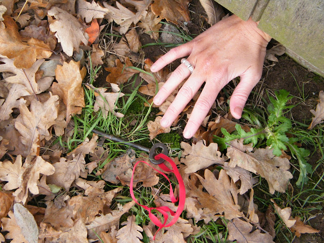
5)  This is the final image I chose. It is a close-up shot of the girl’s hand reaching out under a door for the key, suggesting that the key is the only way to freedom. This is a significant image in the trailer as it shows that she could be close to freedom, but might just fail, keeping the audience in suspense so hopefully they then want to watch the film. We used this image at the very end of the trailer; it is a good shot to finish off the trailer as we want to know what happens to her next.

During this process I feel as though I contributed by doing some filming, planning and editing. I did some filming and felt that I learnt how to film particular shots and the different techniques to shoot a scene. I did some planning where I learnt how to set out when to shoot our shots, for how long and where to shoot the shots, I also feel that I learnt some more group skills and how to work in a group. I also did some editing where I learnt how to put all of our shots on the computer software, how to create titles, how to cut bits of our shots, how to add and remove music/sound/dialogue, how to add special effects and how to add transitions. As we are a small group of three we all contribute in the filming, planning and editing. We all help each other and try to have an equal part in the process, which is how I have learnt so many skills. When filming the real trailer, I feel as though I could contribute in the same ways as I did in the animatic. I have learnt the skills to film, plan and edit, and believe our finished product will be a lot more sophisticated as a trailer. As we have had a practice run to vaguely see how are trailer would look like, we know the things we need to improve upon and so, can make a much better film trailer.

Inception Poster Analysis


Thriller movie poster analysis
Title:
·         The film’s title ‘inception’ suggests that there are a group of people who are interfering with another person’s life
·         Inception also suggests that the film could be about seeing into the future
·         The film’s title is shown near the bottom of the poster
·         The font size is a lot bigger than the rest of the text on it
·         The title uses all capital letters to make itself bolder
·         The title is also red; where as the rest of the text is white. All this makes it stand out and easily identifiable to the audience
Main image:
·         This main image has used special effects in creating the background of the buildings going vertically towards the sky
·         In front of that are the main characters in the film, with the most important at the front, as it is the main character we focus on when we look at it
·         The background shows us that they want us to see that this is a big city with cars at the back and people still walking on the sidewalk
·         When we see this image of the street curving, we can figure out what type of genre it is, and we also see it’s something different that you usually wouldn’t expect, which is why it entices you
·         Each character is dressed in a suit holding a gun, so we see them as being a gangster type of group
·         The colours focus mainly on a light blue spreading to a darker blue this making it seem more like a film and less like real life.
Film Stars:
·         All of the stars names are at the top of the poster
·         We see the biggest film star, with his name big at the top running across the page in white.
·         The other film stars which are less know, underneath the biggest star, their first name in red and surname in white, this is mainly to highlight the biggest stars name, as if the other film stars first name were in white, it would take the focus off the biggest stars name
·         The main film stars are all shown on the poster, the main character is not usually associated with this type of genre and we see this by the way he is dressed and the fact that he is holding the gun
·         Each character is looking away from one another, which shows that they might not be in a strong relationship, and shows that they could be enemies.
Tag-line:
·         The tag-line is ‘your mind is the scene of the crime’.
·         Seems to show that it is a psychological film, and creates the sense that the movie is about something you do with your mind
·         It is shown just underneath the film stars in white again.
Credits:
·         The directors name is not shown, instead they have written ‘from the director of the dark night’, this is because the dark night was such a big success and the director might not have been recognised to everyone if his name was put on the poster
·         The director is shown underneath the title in white again
·         Every word is capitalised
·         Underneath the director it says some more things probably about the production and the people involved
·         There is also the production company and website shown at the very bottom, in small font and in white again
·         At the very bottom it shows the release date in white and the same size font as the main film star, as the date needs to stick out to the audience as well.

The films target audience seems to be 15-35 mostly male, judging from the poster. This poster also shows something different and shows something which advertises its film a bit differently, which is why we look more interested in it. This film looks differently id say mainly because of the buildings curving, and interests you because of how many main stars are in the film.

My Plot Synopsis

Plot Synopsis

The film will revolve around a young female (Nicole – ‘18’) who is a student still in school. She is the main character with only a few scenes of other characters making an appearance in flashbacks of the trailer. The film trailer starts with the girl stuck inside a closet; we don’t know how she got in there, why she is in there, or how she is going to get out. The female character will show to be a popular student, with high grades - we will show this in the trailer by a flashback of her teacher throwing down her results paper on the desk with disbelief and a close up shot of her results paper with the highest grades on. In the film trailer using a flashback we will also show that she comes from a rich family, by a shot of her house and her parents giving her the keys to her brand new car (we will see this as the car will be wrapped up in a big ribbon and we will see that she has a big badge on her shirt with ‘18’ on it. She is going to be represented as a young girl with a perfect life, which is why we want to know the secrets behind her being in the situation she is in. She will also be someone who doesn’t care about anyone else but herself, which is why we can see there are lots of people who could be a suspect in doing this to her.
Although we won’t show where she is held in the trailer, in the main film it will show at the end to be directly under the school, because at the start of the film, we would see some construction workers building this huge metal building underground, this building underground will be a containment place for deadly murderers, and there will be a date at the bottom saying ‘15th October 1855’. In the film the next scene would cut to present day, as it will show at the bottom of the screen, and a shot of the school with everyone outside the building, this showing us at the start of the film that there is a big building underneath the school which they might not know about.
Throughout the film trailer we will see that the only way for her to escape from this closet is to figure out the games and puzzles that lie in front of her on the door, objects could also be hung up on the door, to help her with each puzzle/game. To make this film a more exciting thriller we will see that there is a clock on the wall with only a certain amount of time on it, and at the end of the time, the words ‘end game’, making the audience know how long she has got to escape this closet. Each room will have a time limit for her to complete the game. When she completes a game, she will receive a key, and attached to that key will be a date, we will then show in the film trailer her having a flashback to that date, she will try to figure out what happened on that day, and see if something strange could have gone on that day, or if she particularly hurt someone.
She figures out the first puzzle/game quite quickly and opens the closet door to what she thinks is freedom, but in fact finds herself in a small room with another door in front of her and another puzzle/game, with a clock still ticking in this room, she figures out that she is not safe from freedom yet. She has to figure out what she has to do again to find the right way out, as we see she is a bright student, she figures out these puzzles/games quite quickly, with the instructions on the wall and only a few other items. We soon see as she figures out each puzzle/game and opens the door, she enters another room with another door and more games. We watch her struggle as we see her trying to figure out each game, as she doesn’t know how many more there is or if when the clock runs out, that’s the end for her. In the film and near the end of the trailer we will see she has a big decision when she is faced with two doors and two screens on the wall. In one room her mother and in the other room her boyfriend, but although the one person will be in the first room, they would actually be in the second room, as she will think they are in those rooms but have actually been swapped. She will save the one even though she meant to save the other.